Monday, October 29, 2012

The Conte and the Caveman

Err... not him @ subject of portrait. He's a very fine gentleman from Chennai, India. I was referring to the artist. But read on please...

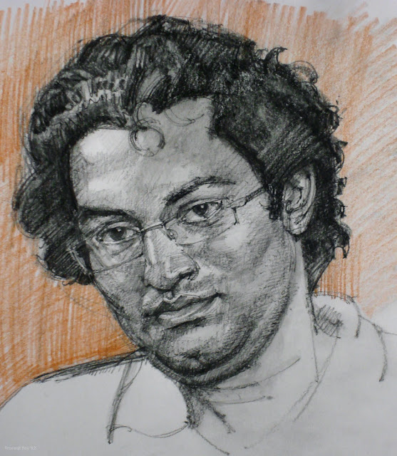
Approx. A4 in size, conte.


 After I had posted this drawing on an art forum, a member asked me how I could get those very thin lines with conte. He was actually referring to the 'conte sticks' (pic below) - those short, square cross-section sticks that Conte makes. I wrote back that I didn't, since I was (also) using conte pencils (pierre noire). However, even the humble conte stick is capable of doing wonderous things, including making those very fine lines! Having said that, I waxed eloquent on the following, which I'm (largely) copy-pasting below...

By the way, the ref image is by Muralidharan Alagar, modeled by his friend Sumit, taken on the occasion of an art camp at the Cholamandal Artists' Village, Chennai.

It was mid- to late-afternoon. I had just finished the portrait above, which was then posted online, immediately following which the query was made. I wanted to demonstrate the versatility of the 'used' conte stick and took its picture. Then I proceeded to draw the ear sketch (posted further below). When used with a soft enough hand, and after you have got it shaped in that way (following a period of use), the stick is wonderfully versatile in producing a wide variety of marks - both in line depth and line thickness/width. I'll elaborate further..

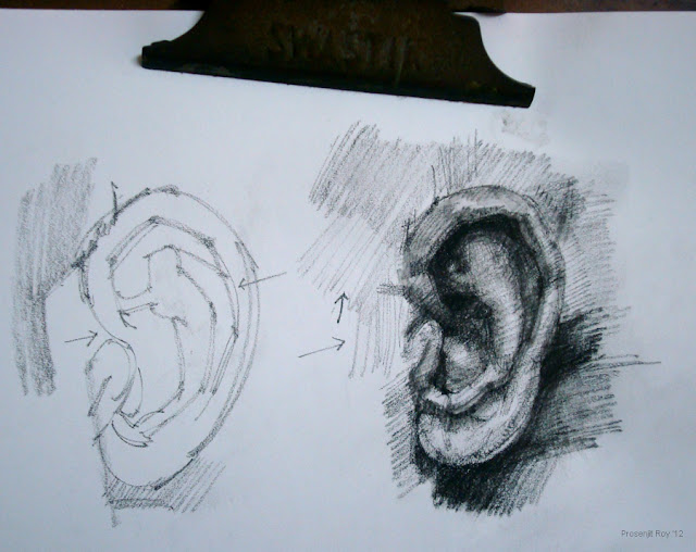
Look at the many micro facets on its surface, the very sharp and pointy tip, and the knife-like edge that's extending down from it. Remember paleolithic tools used by cavemen? Those sharp-tipped, multi-faceted stones they used as arrows and knives? Well, this conte has become like a softer version of those (with me being the caveman in my studio-cave :D).


 Now look at this little sketch (top half of an A4 page clipped to a board) which I made just after taking the pic above, entirely with that very conte - so as to demonstrate its wonderful versatility. These are a couple of ears, drawn side by side (from same ref actually, although shapes have differed). The one on the left shows just the outline, while the other one has tone, mostly achieved with hatching (I have used a moistened brush to even out the tones later on, but that's irrelevant to our discussion). Can you see the very fine hatching lines (which the arrows are pointng at) drawn with the sharp tip?


Thanks so much for viewing/reading.

Friday, October 19, 2012

W.I.P. study on Rodin's Mahler


OK, this is pursuant to a discussion I've recently had on an art forum regarding modeling sculptures from unsatisfactorily lit references. It's always best to draw from the object directly (i.e, 'live'),  but often times all we have is a pictorial reference. However, if even that is not suitably lit (which means that the dominant light is preferably angling down from the side, in front, along with a soft reflected glow on the shadow side) and the shadows are scattered all over, the outcome is often flat.

In that case, one really needs to 'invent' a dominant light, and suppress the other sources. In this exercise, I've downplayed the other two lights in the ref - one coming from the front, and the one coming over his left shoulder. The main band of terminator or core shadow thus passes down the face, with his right side most well-lit. Mind you, this was really intended to be an 'example sketch' of sorts, to emphasize on certain points. In that respect, it is hardly a proper, patient study... took me about 2-2.30 hrs more or less.

W.I.P. no.1. - Outline.


Preliminary sketch in conte. After establishing the basic shape of the head, and putting in the facial features in proper relationship to each other, I was marking out the broad shadow areas. These I'll be filling in, in the subsequent w.i.p.


W.I.P. no 2. - Blocking in


After filling in or 'blocking' the basic shadow shapes, giving predominance to the light coming in over his right shoulder, I had used a moistened brush to 'push' the dark pigment from the shadows into the white areas. I preserved paper-white in the highlights only. You can see this effect on his right, forehead area...  those faint brush marks.

W.I.P. no. 3. Background


Here I've used some yellow ocher watersoluble pencil for the background. So as to better integrate the BG with the head, I have also introduced some of this BG color (as reflected light) on the bust itself. In the next/final stage (which is same as the pic posted at the top of this thread) I'll be adding more details.

FINAL stage


Here I've basically darkened certain areas in preference over others e.g. the eyes, the mouth etc., smoothened out the transitions between the variously illuminated areas a bit, and over-all... worked on the 'turning shadows' or terminator shadows (darker area between two illuminated zones) to give the form greater dimensionality. Actually this was the easiest part - work-wise, but I had to be careful so as not to 'equally blacken up' all areas. Since the illumination in the ref was scattered/indefinite... I had to ensure that the bust doesn't end up appearing flat, hence some careful contrast work.

Hope it all made some sense, and thank you so much for reading! :)

Wednesday, October 17, 2012

Figure study, acrylic - Oct '12

50 cm x 35 cm (19.6" x 13.7"), acrylic on canvas paper.


 Ref image by Aimeestock Fitzgerald (aimeestock) in Deviantart. 

Tuesday, October 16, 2012

Skewed viewing

I can't remember this gentleman's name who had posted online (in wetcanvas.com) pictures of his figure sketches snapped from a perspective. I thank him for that. I thought it was, in addition to being a very interesting way to view pictures, also helps test if your proportions still look alright despite the skewed angle of viewing. So I snapped pics of a few of mine as well.

All are on A3 pages, sketched using an assortment of conte and watersolubles. Needless to say, I'm totally indebted to the photographers and models (credits posted below), whose work I've referenced for my studies.

a.

b.

c.

d.

e.

f.

g.

h.
 And just for the sake of comparison (this one with no. f)... taken from the proper angle: sure does exaggerate a few things!

i.
And here's just a couple of additional sketches of the 'non-skewed' variety...

j. charcoal sketch

k.

Thanks for viewing! Credits for the refs belong to the following in DeviantArt :- for nos. a, c, f & h  - Skydancer-stock ; For nos. e, j & k -  proud59; For nos. b, d & g -  I'm not sure, and I'm trying to find out. But heartiest thanks anyway to everyone, for helping extend my education :)

Prelim for Mr Moon's GF

*** UPDATE - final version is posted here ***

Preliminary sketch for a possible future composition - approx A3 size, watersoluble crayons and  pencils. BTW, those are finger cymbals in her hand... tiny things attached via a loop to the middle finger and thumb. This was referenced from a partial picture kindly provided by a dear friend.


Sunday, October 7, 2012

Horsey Figures - 3

Horses are people too :)

As stated in previous posts on horses, I do find a lot of similarity between drawing humans and horses. The proportional issues can be dealt with likewise, e.g. by using head length as unit for measurement, and the muscle/skeletal topography is quite analogous. In addition, its a pleasure to draw the great sweeping curves in horses, and try to depict the throbbing, restless sense of vitality.So here goes, a series of sketches made in the last few days...

All in A3 size paper, using conte, charcoal, pastels and watersoluble crayons/pencils. Ref images, unless otherwise stated, by Breathless-dk on deviantart. Please click to view at FULL size.


Pastels
Pastels